Creating an eLearning design poses several challenges. One must address learner engagement, content relevance, and delivery methods.
I often receive queries on how to consider all these factors when designing e-learning content. Some ask me if it is possible to integrate all these elements effectively without compromising the quality of the learning experience.
So, I thought of creating this blog post for you. I’ll cover the eLearning design process and offer examples to guide you in creating impactful eLearning designs.
What Is an eLearning Design?
An eLearning design is a process by which you create engaging and effective online learning experiences for various audiences and purposes.
It involves applying instructional design principles, multimedia elements, interactivity, assessment, and feedback strategies to achieve specific learning outcomes.
Key Principles of an eLearning Design
“The most important principle for designing lively e-learning is to see e-learning design not as information design but as designing an experience.” – Cathy Moore, Training Designer.
Having been in the training industry for quite some time now, I have seen that most eLearning experts follow the principles I have discussed below.
In fact, a meta-analysis by Clark and Mayer (2016) found that applying the e-learning design principles of multimedia, contiguity, modality, redundancy, coherence, personalization, and segmenting resulted in an average effect size of 0.87, which means that learners who received instruction based on these principles performed 87% better than learners who received traditional instruction.
So, without any delay, let’s understand what these principles are.
1. Multimedia Principle
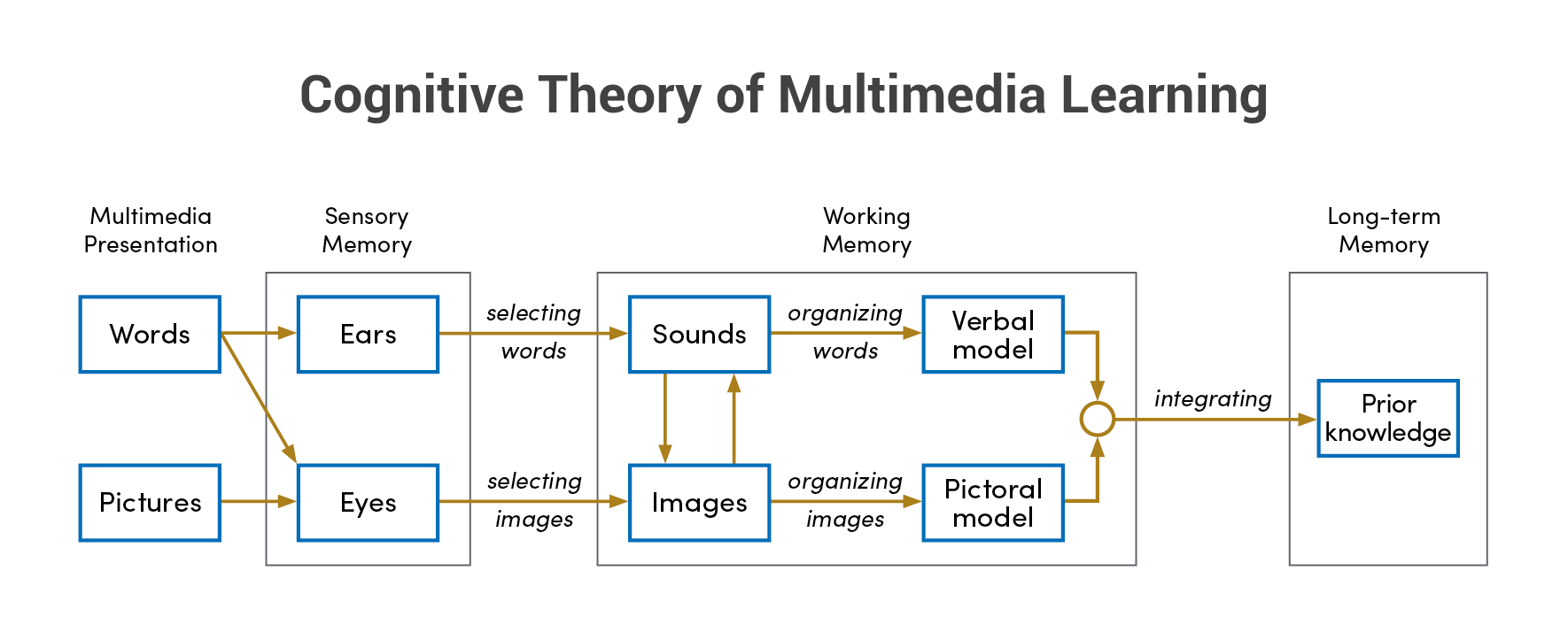
This principle uses words and graphics together, rather than words alone, to convey information, and appeal to visual and auditory learners.
Multimedia learning can increase learner engagement by 50% and retention by 40%. (source)
- Embrace diverse learning styles: Combine text, visuals, audio, and video to engage learners with different preferences and information processing methods. For example, incorporate screenshots, animations, and voiceovers in your training alongside textual instructions.
Pro tip: You can share this quiz with your learners to know their learning styles. - Enhance clarity and retention: Present related information visually and textually to strengthen understanding and minimize cognitive strain. Imagine watching a video of a harassed employee sharing their experience and feelings, along with a narration that explains the legal and ethical implications of the situation, rather than reading a long text that describes the same case.
Hope it makes sense.
If you want to know more about multimedia learning, I’d suggest you read this guide by Richard Mayer. I must say it’s an excellent resource!
2. Modality Principle
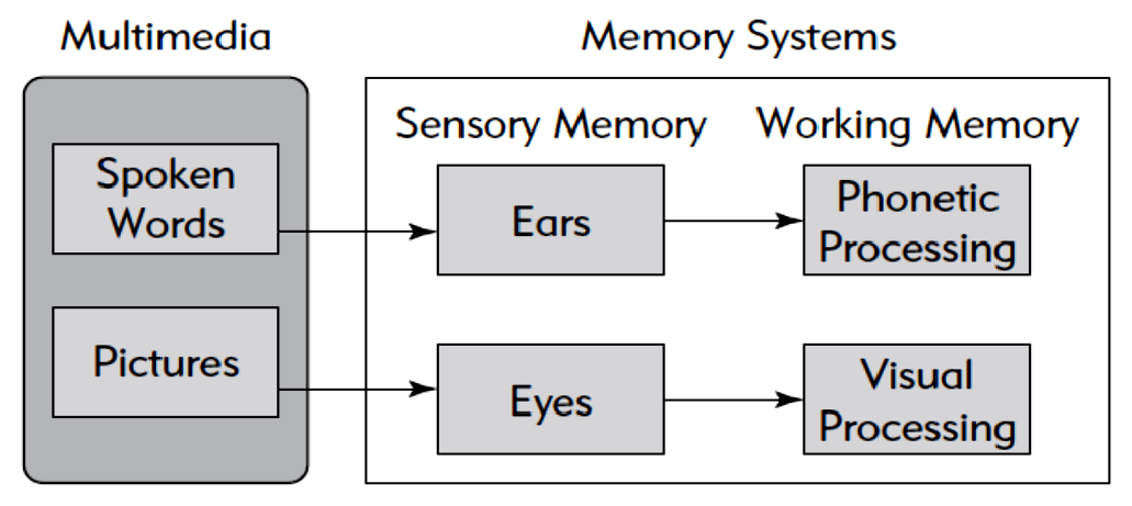
According to this principle, you can use audio narration rather than on-screen text to explain graphics. Learners can process visual and auditory information in different channels rather than competing for the same visual channel.
- Reduce cognitive load: Use voice narration to explain while showing related visuals. This method helps learners understand better by using different ways of learning. It also makes it easier for them to think and learn. For example, when showing complex diagrams, use clear spoken instructions instead of putting too much text on the visuals.
3. Segmentation Principle
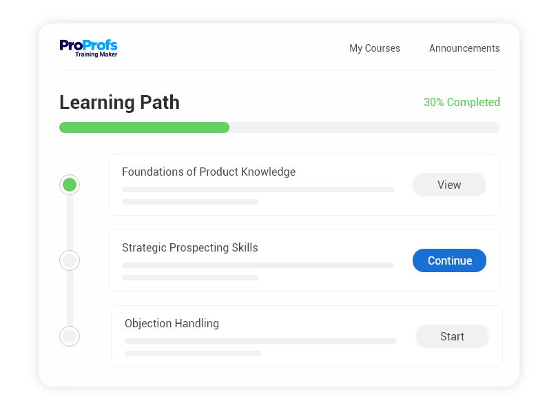
This eLearning design principle breaks down complex information into smaller, manageable chunks and allows learners to control the pace of the presentation. This helps learners focus on one segment at a time and avoid cognitive overload.
- Chunk complex information: Break down content into smaller, manageable modules or lessons. This improves focus and facilitates knowledge retention. Deliver training in short video segments or interactive modules instead of lengthy presentations.
Here’s a fantastic tool that my organization uses for segmentation. It’s ProProfs Training Maker. This online training software allows users to create different learning paths, groups, and roles for their learners.
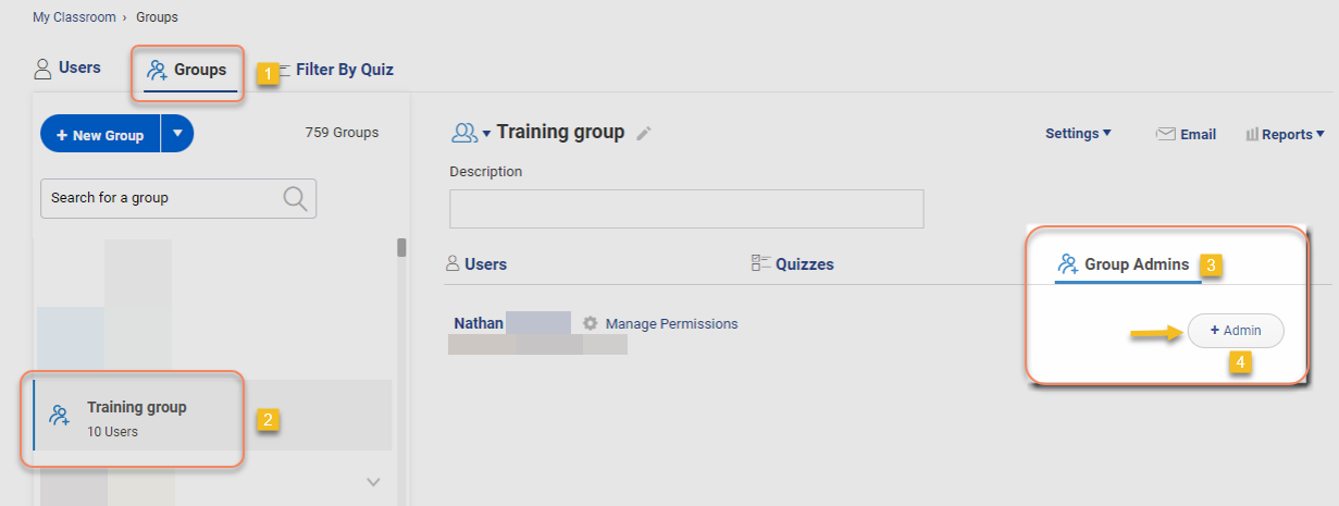
The tool also supports multiple languages and instructors, which further enhances the segmentation and customization of your e-learning programs.
4. Personalization Principle
According to a survey by Brandon Hall Group, 90% of companies agree that personalized learning supports continuous development, and 93% agree that personalized learning helps employees reach their goals more efficiently.
So, what is the personalization principle?
As the name suggests, this principle uses conversational style and human voice rather than formal style and machine voice wherever possible. This creates a sense of social presence and increases learners’ motivation and interest.
- Connect with your audience: Use a clear, concise, engaging writing style that resonates with your corporate learners. Avoid overly technical jargon or overly formal language.
5. Practice Principle
We often hear this saying: Practice makes a man perfect.
But in e-learning, only perfect practice makes perfect. Even Vince Lombardi says so!
That’s what the Practice principle is all about. It is not just about providing activities but creating a structured and supportive environment for learners to actively apply their knowledge, receive feedback, and improve their skills.
- Reinforce learning through action: Provide frequent opportunities to apply newly acquired knowledge and skills through practical exercises, assessments, and real-world scenarios.

This strengthens understanding, identifies knowledge gaps, and fosters confidence in using learned skills.
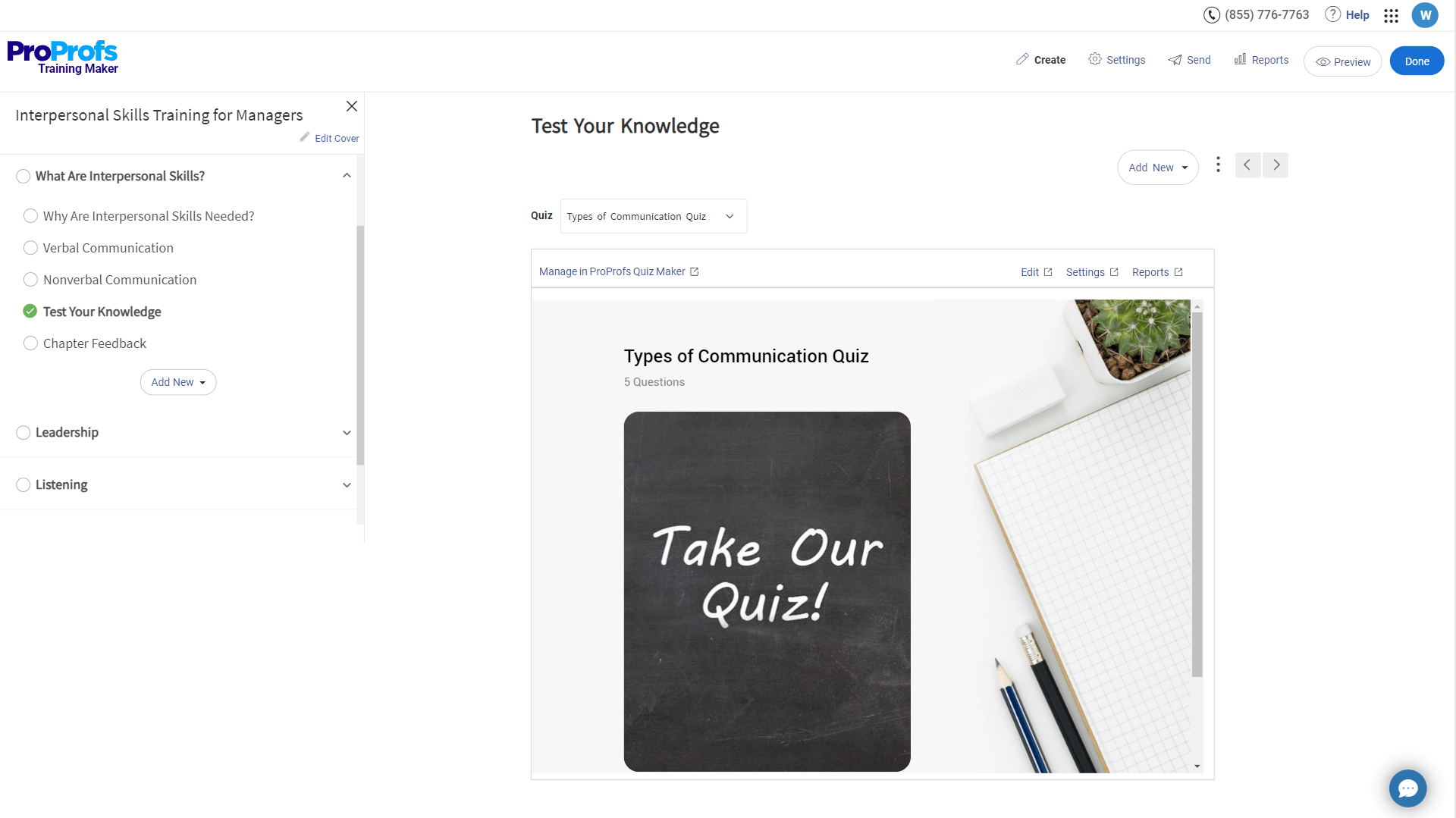
- Offer immediate feedback: Include feedback tools in your eLearning, such as quizzes, simulations that evaluate performance, or activities that involve reviewing by peers. Through this, learners see where they need to improve and change their learning strategy, which results in better memory and skill growth.
Here’s a training course on how you can give great feedback to your learners.
- Encourage spaced repetition: Design your eLearning to integrate practice opportunities throughout the course, not just at the end.

This promotes spaced repetition, a method proven to enhance long-term memory and knowledge retention.
Important note: These principles are not hard-and-fast rules but strategic recommendations to help you create the best corporate Learning design. Experiment and fine-tune your approach based on your specific content, audience, and goals.
Get Free eLearning Authoring Software — All Features, Forever.
We've helped 567 companies train 200,000+ employees. Create courses in under a minute with our AI LMS or use 200+ ready-made courses on compliance, harassment, DEI, onboarding, and more!
eLearning Design Process: 6 Steps
Having seen how our organization tackles eLearning design, I can share the key steps we follow to create impactful learning experiences.
Usually, we use a mix-and-match of the principles discussed above.
1. Define Your Goals and Audience
This step involves identifying the specific challenges and learning objectives for the training program. Identify your target audience and their learning styles, existing knowledge, and expectations to tailor the content accordingly.
- What problem are you solving? What knowledge, skills, or attitudes do learners need to gain?
- Who are your learners? What are their learning styles, prior knowledge, and expectations?
Once you identify your audience, you can set your learning goals and objectives. Make sure you set SMART goals. Unrealistic targets lead to disengagement, frustration, and lower learning outcomes.
2. Develop a Learning Strategy
Once you know your audience and their preferred learning style, it becomes easier to create a strategy. Organize the content logically and choose the right mix of instructional methods to keep learners engaged.
How can you do that?
- Choose the right format: Will it be a course, module, quiz, or simulation? Consider learner preferences and content complexity.
- Structure the content logically: Break down information into manageable chunks and organize them in a clear sequence. (This is where we incorporate the segmentation principle)
- Select appropriate training methods: Pick the right employee training method to cater to different learning preferences and objectives.
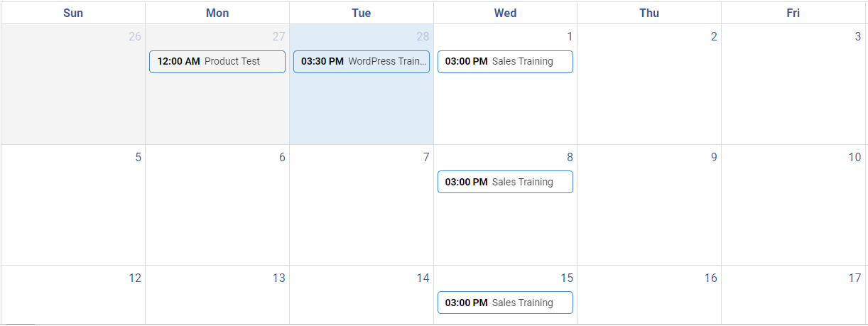
- Use a training calendar: Set up and hold training sessions online and in a classroom setting.

A training calendar will help you plan and organize training sessions. It also informs learners about future training opportunities.
3. Write Engaging Content
The focus here is on writing clear, concise, and engaging content that avoids jargon and breaks down complex concepts.
Don’t know what to include in your content?
Use professionally designed templates to provide a structured format that instructors can easily customize. Here’s what an eLearning design template looks like: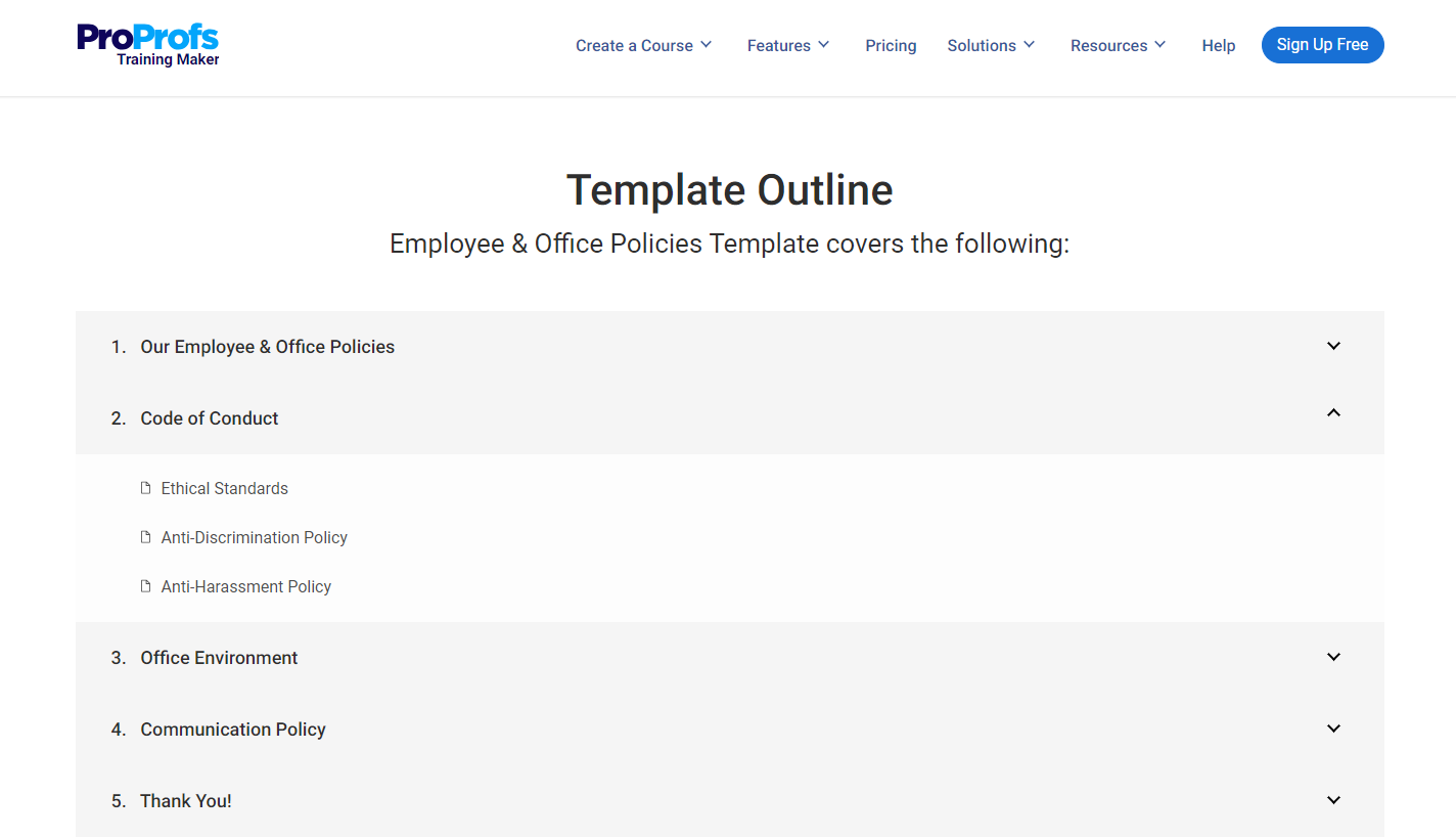
Once you have the template with you, it becomes easy to create your eLearning programs. Here are some ways to make your content engaging.
- Focus on clarity and conciseness: Use simple language, avoid jargon, and break down complex concepts. (Here, the focus is on the personalization principle. We try to keep the content simple with the learner’s needs in mind to ensure they get what they wish to learn.)
- Tell stories and use examples: Make information relatable and memorable through real examples and case studies.
- Incorporate humor and personality: Keep learners engaged and avoid a monotonous tone.
- Enable collaboration and discussions: Let your learners stay in touch and exchange knowledge. They can post queries, ask questions, give comments, and interact with their peers.
| Don’t have much time to create your courses?
No worries! Try ProProfs Training Maker, as it offers not just templates but also prebuilt courses that can be used as-is, or you can modify them based on your learning needs. |
4. Design Visually Appealing Materials
Ensure the training materials are consistent and professional. This should involve choosing clear fonts, colors, and layouts. (This step is based on the multimedia & modality principle).
- Incorporate high-quality multimedia: Images, videos, narrations, podcasts, and infographics can enhance understanding and engagement.
- Ensure accessibility: Consider color contrast, alt text for images, and keyboard navigation for all learners.
5. Build Interactivity and Promote Healthy Competition
Following the principle that “only perfect practice makes perfect,” as Vince Lombardi suggests, we focus on creating environments where learners can actively use what they learn, get feedback, and improve their skills.
This step is essential because it ensures learners engage in meaningful practice.
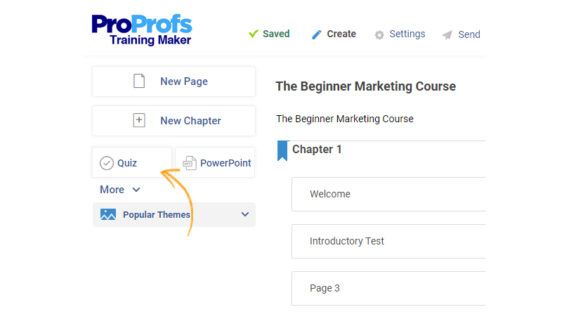
- Include quizzes, games, and simulations: Encourage active participation and reinforce learning.
- Provide immediate feedback: Help learners identify strengths and weaknesses.
- Offer opportunities for self-reflection: Encourage learners to connect new knowledge to their existing experience.
6. Test and Refine
It’s crucial to remember that simply creating the course does not suffice. One must assess the effectiveness of the course. How does one achieve this?
The answer lies in pilot testing. I recommend conducting a small group pilot test before full-scale deployment. Gather feedback and identify areas for improvement.
- Make revisions based on feedback: Ensure the eLearning is effective and meets its goals.
- Continuously monitor and update: Keep your eLearning relevant and up-to-date.
Bonus Tips
- Use a learning management system (LMS): Manage access, track progress, and deliver certificates.
- Make your eLearning mobile-friendly: Ensure learners can access it on any device. Try ProProfs’ mobile LMS!
By following these steps and incorporating best practices, you can create an eLearning design that is informative, engaging, and effective.
5 Responsive eLearning Design Examples
Have you ever wondered what makes eLearning truly engaging and effective? The answer lies in responsive designs. In this post, I will present the five elements that make up exemplary eLearning designs. Buckle up and prepare to be inspired!
1. Fluid Layout
A fluid layout automatically adjusts the size and position of elements based on the screen size and orientation. This ensures that learners have an optimal viewing experience regardless of their device.
Importance: Fluid layouts prevent learners from having to zoom in or scroll horizontally, which can be frustrating and disrupt the learning flow.
2. Flexible Images and Videos
Images and videos should be scalable and responsive to different screen sizes. This means using formats like JPEG and MP4, which are widely supported by most devices.
Importance: Learners shouldn’t have to wait for large images or videos to load, and they shouldn’t experience pixelation or blurry visuals.
3. Responsive Typography
Use fonts that are easy to read on all devices, and adjust font sizes based on screen size. Avoid using too much text on a single screen, as this can be overwhelming for learners on mobile devices.
Importance: Clear and readable text is essential for effective learning. Responsive typography ensures that learners can easily access and understand the information presented.
4. Touch-Friendly Interactions
Interactions such as buttons, sliders, and drop-down menus should be designed to work well on touchscreens. This means making them large enough to tap easily and ensure they respond quickly to user input.
Importance: Making your eLearning course accessible ensures that all learners have an equal opportunity to participate and learn.
5. One-Page Resource
A one-page resource stands out in learning design for its concise, focused approach. It simplifies knowledge absorption and retention by integrating features, services, showcases, customer stories, resources, pricing, and login sections in one accessible spot.
Importance: This design streamlines the user experience, allowing quick engagement with necessary content without multiple-page navigation. Responsive design ensures uniform quality across devices, meeting modern demands for fast, accessible, and efficient educational tools.
By following these elements of responsive eLearning design, you can create eLearning courses that are accessible, engaging, and effective for learners on all devices.
How to Become an eLearning Designer
Over a decade of experience in this industry has granted me valuable insights into the qualities companies seek in aspiring eLearning designers.
Based on these observations, I can offer several suggestions for your journey.
Formal education, while beneficial, is not the sole determinant of success. A genuine passion for learning and the ability to translate complex concepts into engaging narratives are crucial.
Technical proficiency is equally essential. Familiarity with authoring tools like ProProfs Training Maker, Articulate Storyline, or similar tools, and a basic understanding of programming or graphic designing is important.
Understand the foundational principles of instructional design. Grasp the ADDIE model, adult learning styles, and accessibility guidelines to create effective and inclusive learning experiences. Consider online courses, certifications, or self-directed learning to solidify your knowledge base.
Finally, the power of a well-crafted portfolio cannot be overstated. Showcase your best work, including personal projects or volunteer initiatives. Remember, quality over quantity. A compelling portfolio serves as a testament to your skills and design philosophy.
By incorporating these insights, you can embark on a promising path toward becoming a sought-after eLearning designer.
Get Free eLearning Authoring Software — All Features, Forever.
We've helped 567 companies train 200,000+ employees. Create courses in under a minute with our AI LMS or use 200+ ready-made courses on compliance, harassment, DEI, onboarding, and more!
Ready to Create the Best eLearning Design?
We’ve dived deep into eLearning design and uncovered the secrets to crafting impactful experiences.
Remember, there’s no one-size-fits-all design, but these principles are your compass. Use them to tailor your approach, cater to your audience, and keep learning and iterating.
The “best” design is the one that achieves your specific objectives, resonates with your learners, and delivers measurable results.
What kind of engaging eLearning masterpiece will you bring to life? The possibilities are endless, and I can’t wait to see what you dream up.
 Tips
Tips
We’d love to hear your tips & suggestions on this article!
Get Free eLearning Authoring Software — All Features, Forever.
We've helped 567 companies train 200,000+ employees. Create courses in under a minute with our AI LMS or use 200+ ready-made courses on compliance, harassment, DEI, onboarding, and more!

 We'd love your feedback!
 Thanks for your feedback!


